The Utah Jazz recently released a new colour scheme and "new" jerseys to go along with it. Do I like them? No. Nor do I like a lot of NBA jerseys lately (I think my last post gave that away).

Let's start with the Jazz... When the team was first introduced to the league, they began in New Orleans (Jazz music is popular there in case anyone missed that boat). Their colours were purple, green and gold and their name incorporated a "musical 8th note" as the "J," with a basketball at the base of the "J." Everyone loved these jerseys. For whatever reason, the team designed a new logo, leaving out the "Jazz note" and incorporating mountains, in reference to the mountain region of Salt Lake City. I personally liked that logo; it was the one I grew up with. The only thing I didn't like about it was how hard it was to duplicate. I couldn't just scribble the Jazz' mountain logo on my high school binder. The cool thing was that they kept purple as their main colour, and added turquoise as a secondary colour. Loved it! Then, out of the blue, they dropped the purple (which had been their colour since the beginning of time) and went with a light and dark blue scheme. It took me while to get used to, but I eventually came to love it. Apparently, for years, team management heard plenty of whining and complaints to bring back the "Jazz note." I was excited: EVERYONE loves the "Jazz note." No one told me they were going to make the colours sucky, though! Take the jersey shown above, change the purple for navy blue, then don't "fill in" the yellow in the word "Jazz" (as The Grey Nathan pointed out). I think they look disgusting, but maybe I'll come to love them as much as I've loved all of the others. The more I think about it, the more I think I actually would like them had they only FILLED IN.

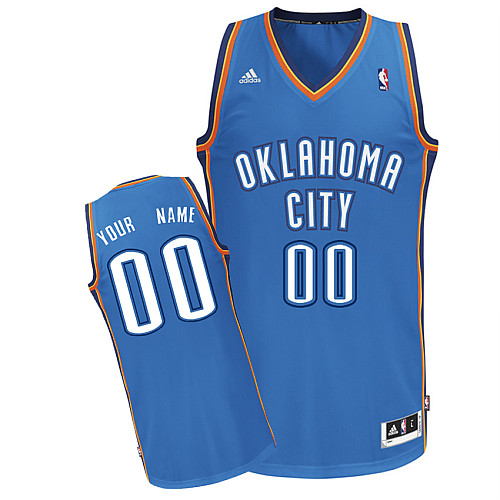
As a lot of people know, I cannot stand the OKC Thunder jerseys. What are the first three colours that come to mind when you hear the word Thunder? I guarantee they are not blue, orange, and yellow. Does anyone in the world actually think this looks COOL? When you see this pool of blue fabric, with boring white writing, and ugly orange trim, do you say to yourself, "That looks AWESOME!"? No! Who got paid to design this piece of crap? Pay me a nickel, and I'll give you a better colour scheme and jersey design. In fact, I'll do it for free. For months, I have harboured a Thunder jersey in my mind, and today I am pleased to announce its unveiling. I present: The New & Improved Oklahoma City Thunder jersey.

If you honestly think that the original jersey looks better than my 10 minute creation using Microsoft Paint, then you're either colour blind, retarded, or have a strange liking for boringness. Enjoy!
 If you honestly think that the original jersey looks better than my 10 minute creation using Microsoft Paint, then you're either colour blind, retarded, or have a strange liking for boringness. Enjoy!
Ha ha ha!! this is a hilarious post.. I did scroll down and compared the new jazz jersey to the old and the lack of filling in the jazz word is rediculous.. it is made even more stupid by filling in the number in yellow.. they need to do the same thing to both, not different.
ReplyDeleteAnd your Thunder jersey makes me laugh.. it is better than the actual jerseys, I love the cloud the most.
in other news, Melo might get traded to the bulls... that would be another pretty good big three in the east. Plus, it would be exciting.
ReplyDeleteI think the best thing about this post is that you hate the Thunder jersey's, but you own one yourself! Nice work! I do also like the new version that you made. Maybe with another couple minutes of work on paint you'd be able to market the change.
ReplyDeleteOn another note, has anyone heard about the Nets changing their name? I think I saw that the Russian guy put in the application to change it in 2 years (the minimum time required I guess) but haven't heard anything else about it. I think that would be sucky. If the Jazz never changed their name even though Utah is the farthest place away from Jazz music, then the Nets shouldn't be allowed to change their name when they just move to Brooklyn.
I also love my cloud...I was gonna' put a lightning bold though it too but someone (I think Beavis) said, "It's not the OKC Lightning." He had a point.
ReplyDeleteIn regards to Melo on the Bulls. At first, I thought it was such an obvious sweet thing for the Bulls. Then I read Sekou Smith's Hang Time Blog on NBA.com and he convinced me otherwise. Noah is the heart, soul, and emotion of that team (like KG is to Boston). Without him, they're good, but they'll never have the heart to win a championship and would sim become the Chicago Jazz. Interesting point to think about, anyway...
Haha, I agree that it is very ironic that I hate the Thunder jerseys yet own one myself. I think that that was part of my thought process when I bought it: "This could be funny to buy/wear since I hate how it looks." Obviously the other thought was knowing that Durant would one day be one of the top players in the league.
I haven't heard anything about the Nets changing their name. That's a dumb idea. I guess the Thunder did it, but that's because Seattle wouldn't let them keep it, haha. The Bullets changed to the Wizards but I don't remember their reasoning, especially since they stayed in Washington. Who cares, anyway? They suck. Lakers (from Minnesota), Jazz (from New Orleans), Hornets (from Charlotte). Keep your freakin' name; it's part of NBA history! What would the NBA be without non-sensical names like Magic, Pacers, Knickerbockers and Celtics?
P.S. Anyone know how to get a jersey designer job?